Recently, I saw someone post about visualizing their DNA match network. They were doing this as a service. You would order a visualization and they would build one for you and send it to you for a nominal fee. It sounded and looked awesome. I noticed they were using an open source program, so I thought to myself, if they can do it, so can I. So, that’s what I did…for the most part.
The open source program is called Gephi and it’s described as the leading visualization and exploration software for all kinds of graphs and networks. And first glance it can seem scary and overwhelming, and it is in some respects. In my job and on my own time, I’ve worked a lot with sets of data; organizing them, analyzing them, morphing them to work in another way, etc. This seemed like something I could do.
Finding the Data
The first issue was figuring out how to get my match data into a format that the software needed. I first tried to get all of my match data exported from Genome Mate Pro, which I was able to do. I just don’t know how to massage it into what I need, yet, at least not without a lot of manual work. So, then I looked at some of the files that are created when I run DNAGedcom to get my match info for GMP. The Ancestry DNA files looked good. They had mostly what I needed. I had to do some minor changes to the files, but overall it worked.
After a bit of a learning curve and some Googling, I was able to get a pretty decent looking network visualization of (most of) my Ancestry DNA matches. I say most since I’m not completely sure if I have all of the connections included. Here is the final visualization, without the names.
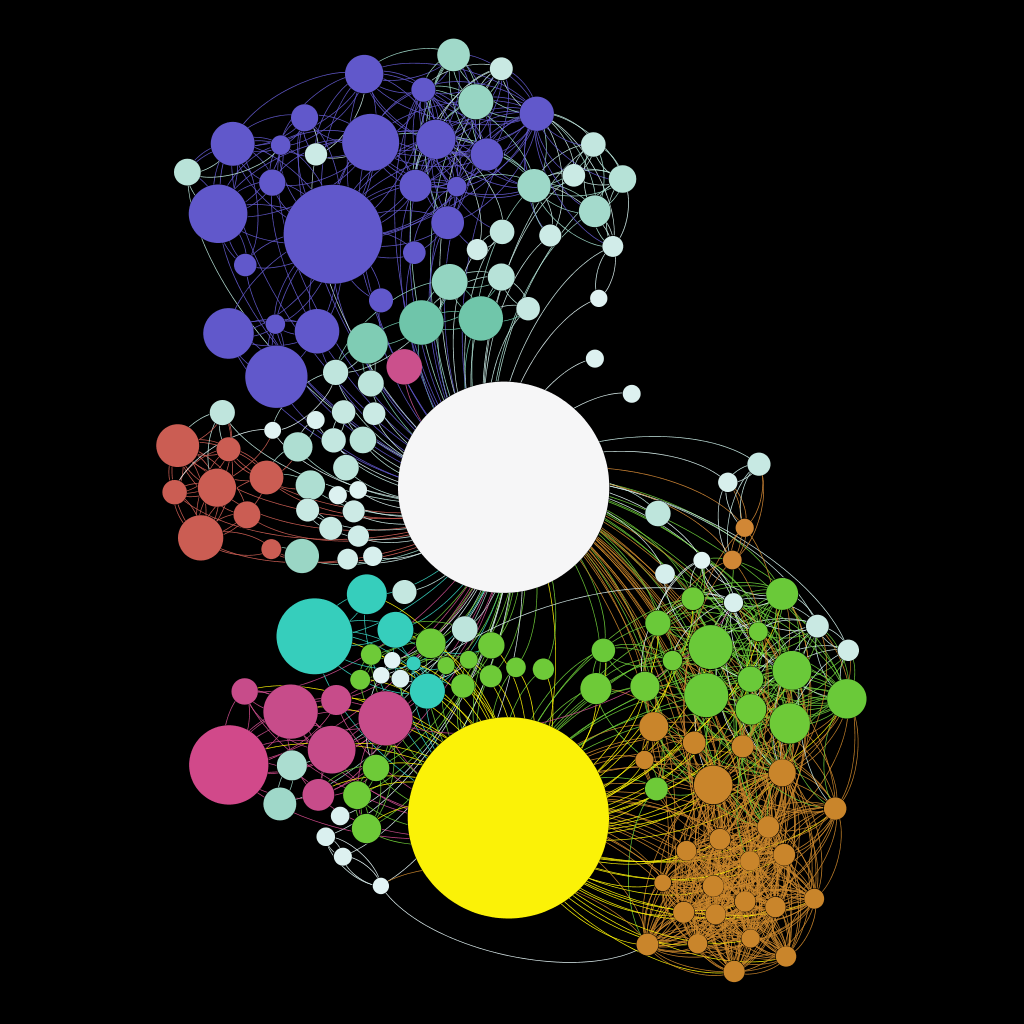
Here is a quick overview. The size of the circles are based on how many centimorgans (cMs) I share with my match and it also shows how closely related we are. This graph only includes matches with more than 20 cMs, so about 4th cousins or so. I color-coded a few of the major lines that I knew based on the match. I am the large white circle in the center. My mother is the large yellow circle at the bottom.
The purple-ish group at the top is from my Corrigan line as the larger one is my father’s cousin. The red group at the left, I think, is a collection of Polish matches. The small teal group under the red is my Thielke line as the larger teal circle is my mom’s cousin. The pinkish group under that one is my Van Price/Van Parijs Dutch side. The green and orange on the bottom right is mainly my mother’s French-Canadian matches. There are a lot of descendants from those original French immigrants as you can see by all of the inter-matching between them. The single pink circle above me is my one and only Zalewski match. You can see why that line is difficult to research. The rest of the randomly colored and white circles are either one-off matches or matches I have yet to organize.
Now What?
My next steps are to not only analyze this graph to see if any odd connections pop out, but also to try to do this with my other data including 23andMe and/or Family Tree DNA. I am also going to try to do it with my Genome Mate Pro data as that has everything in one place, including GedMatch matches. Seeing the software take all of these matches, which are at first in one big blob, and organizing it into the graph above is cool to see as it moves around like it’s alive until it settles.